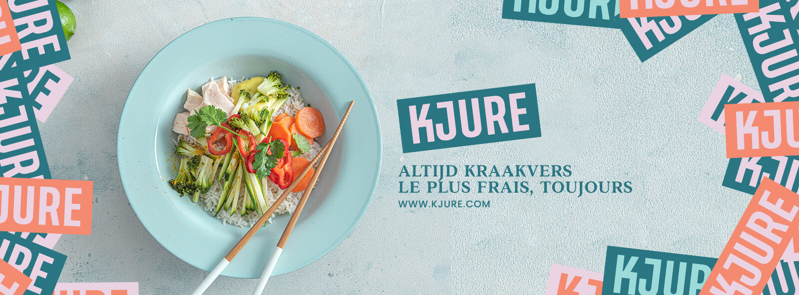
Kjure
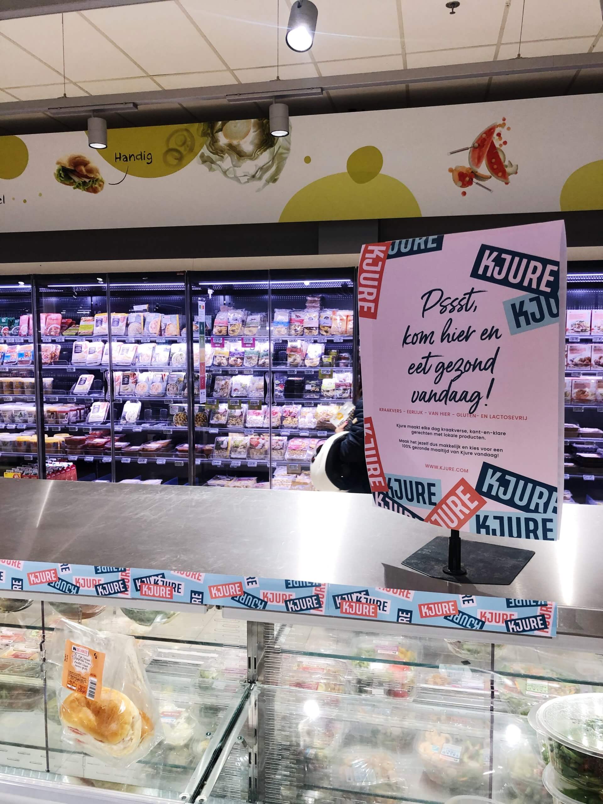
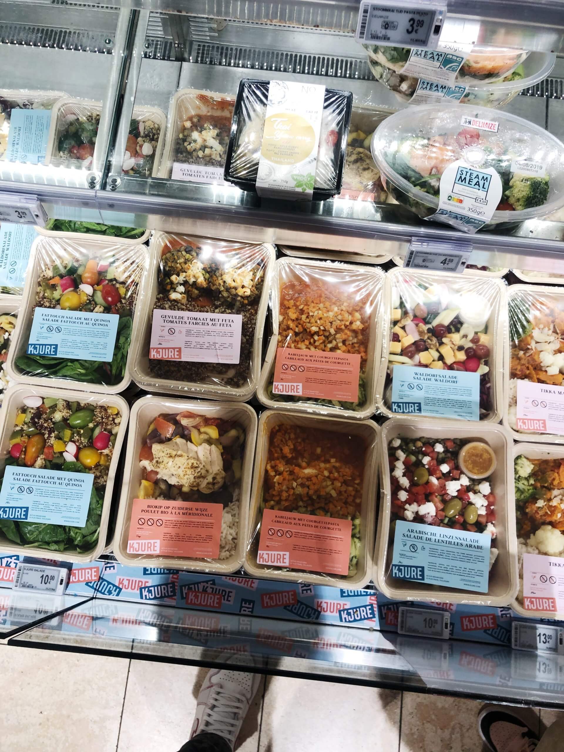
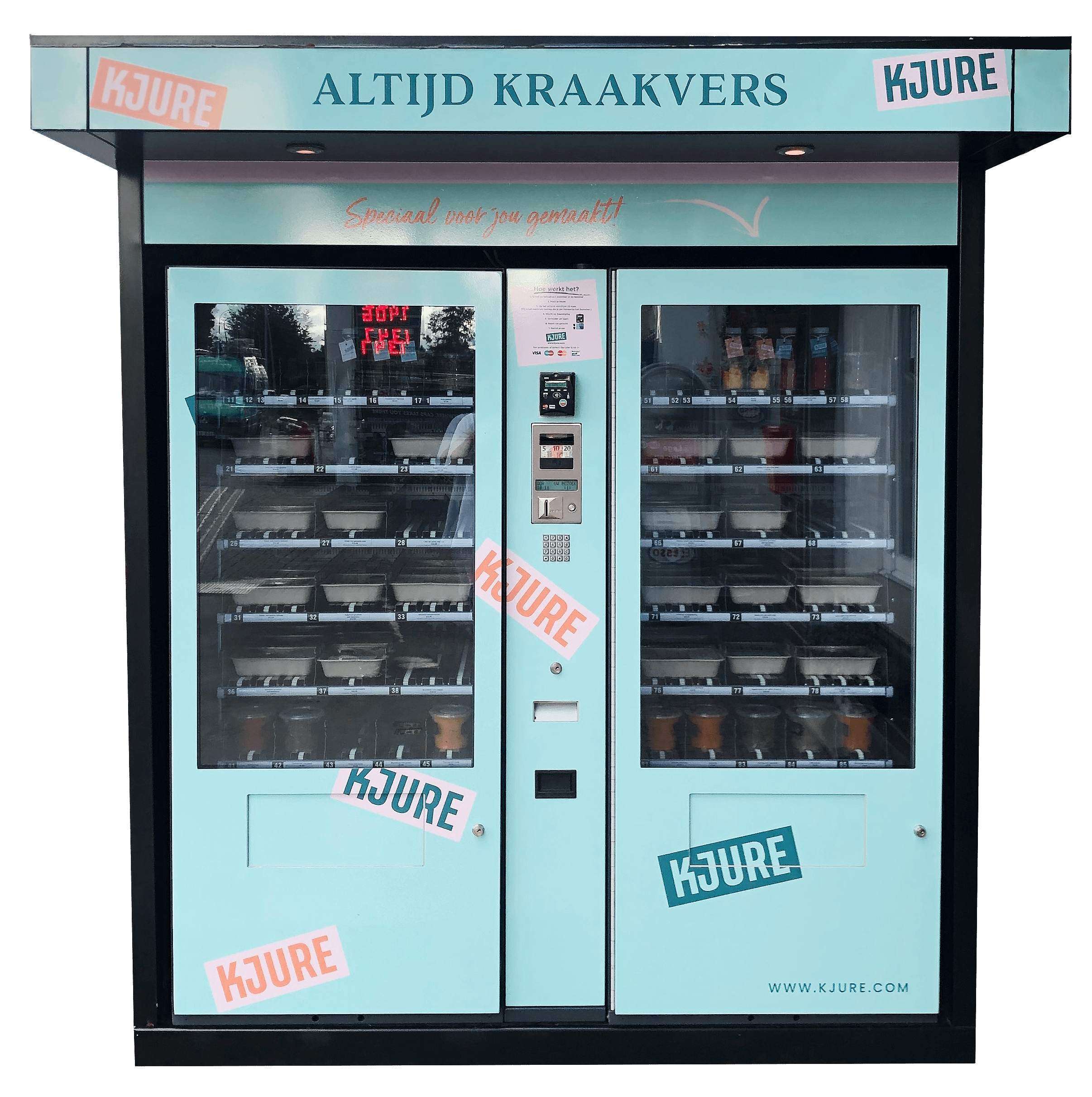
Kjure is a Belgian food company creating fresh meals sold through supermarkets and their own vending machines. Kjure stood out from it's competitors by offering a unique product and ways of selling but was visually not as unique so they approached me for a full rebranding.
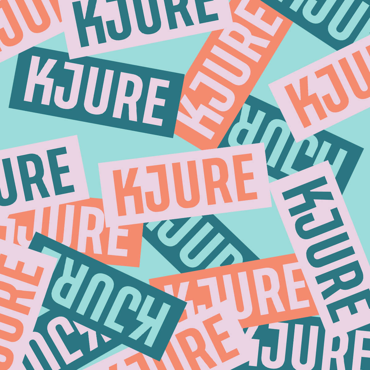
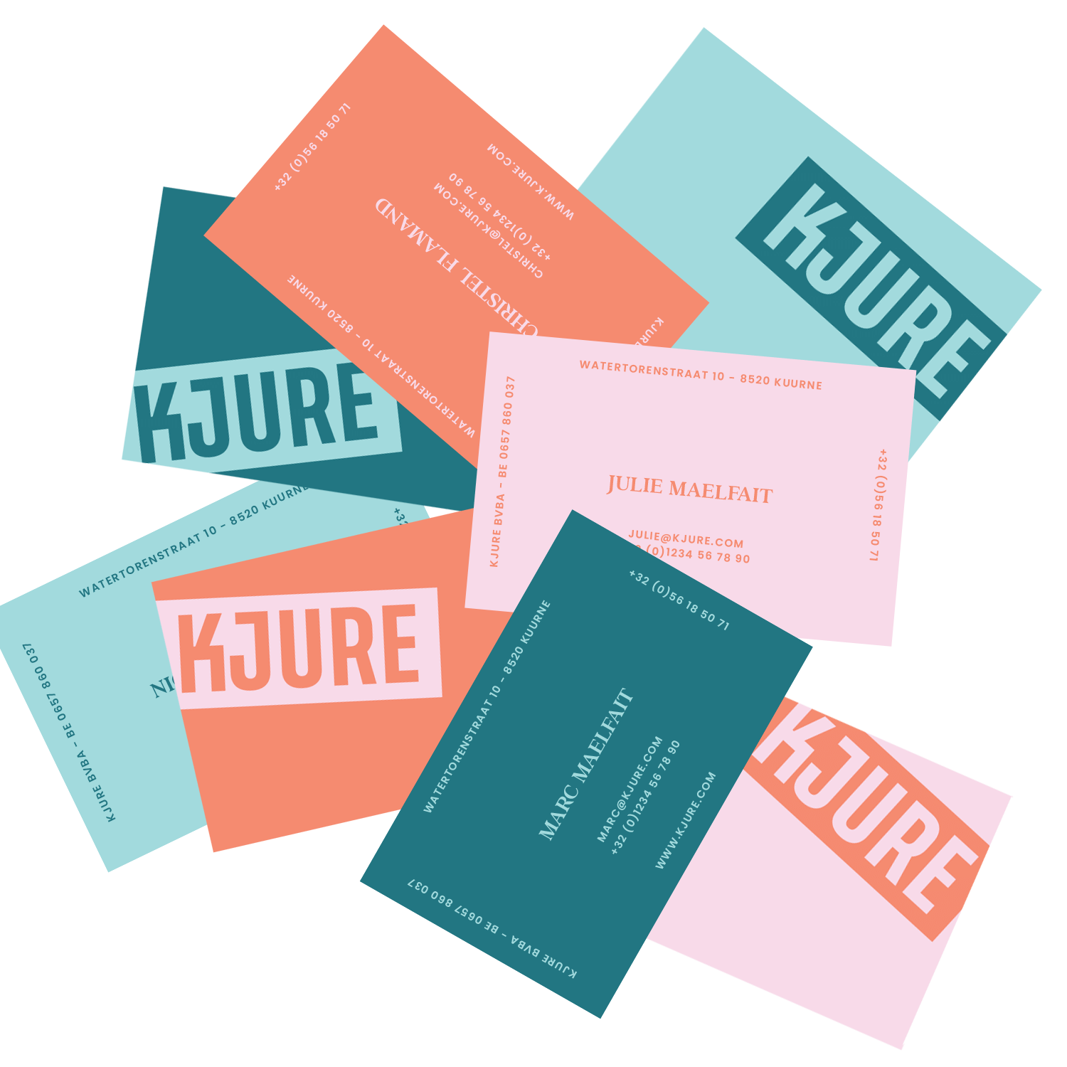
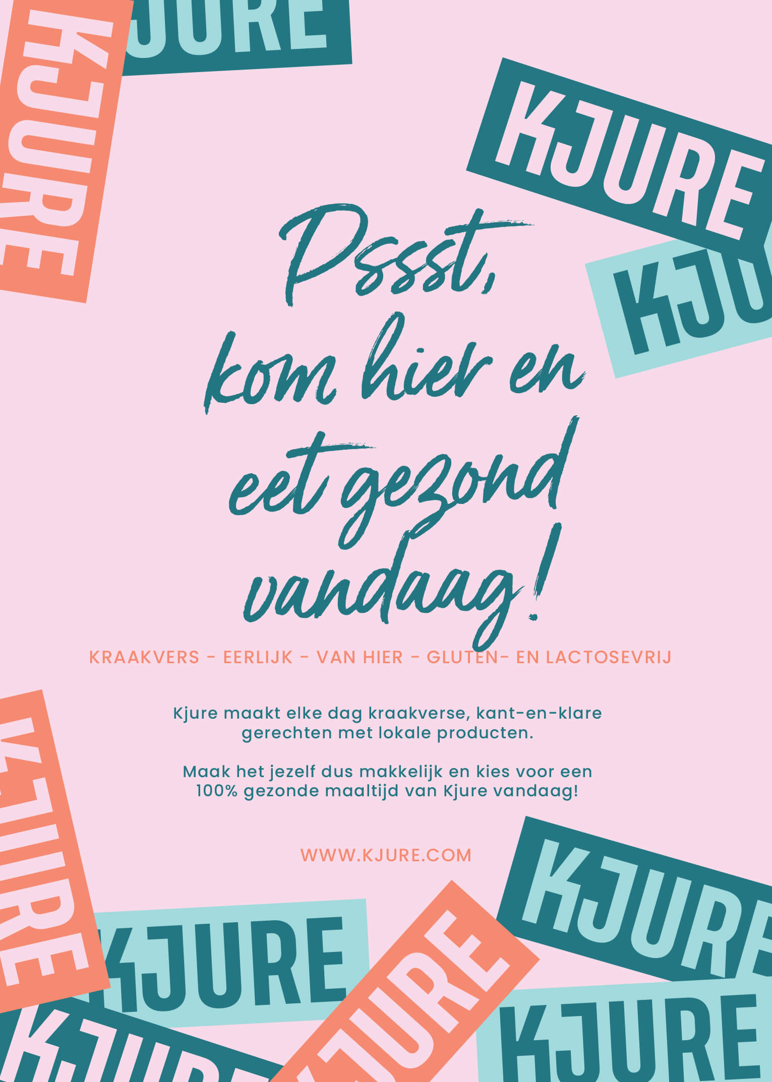
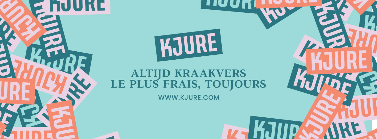
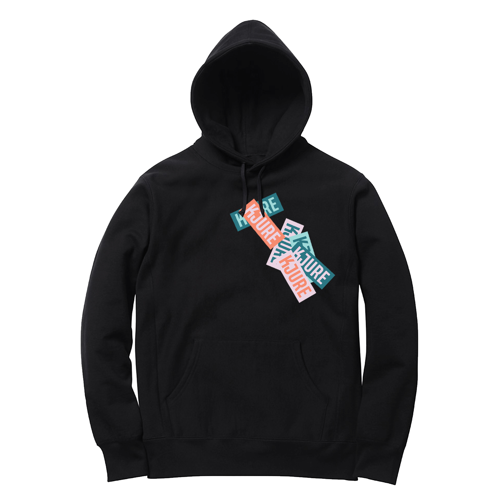
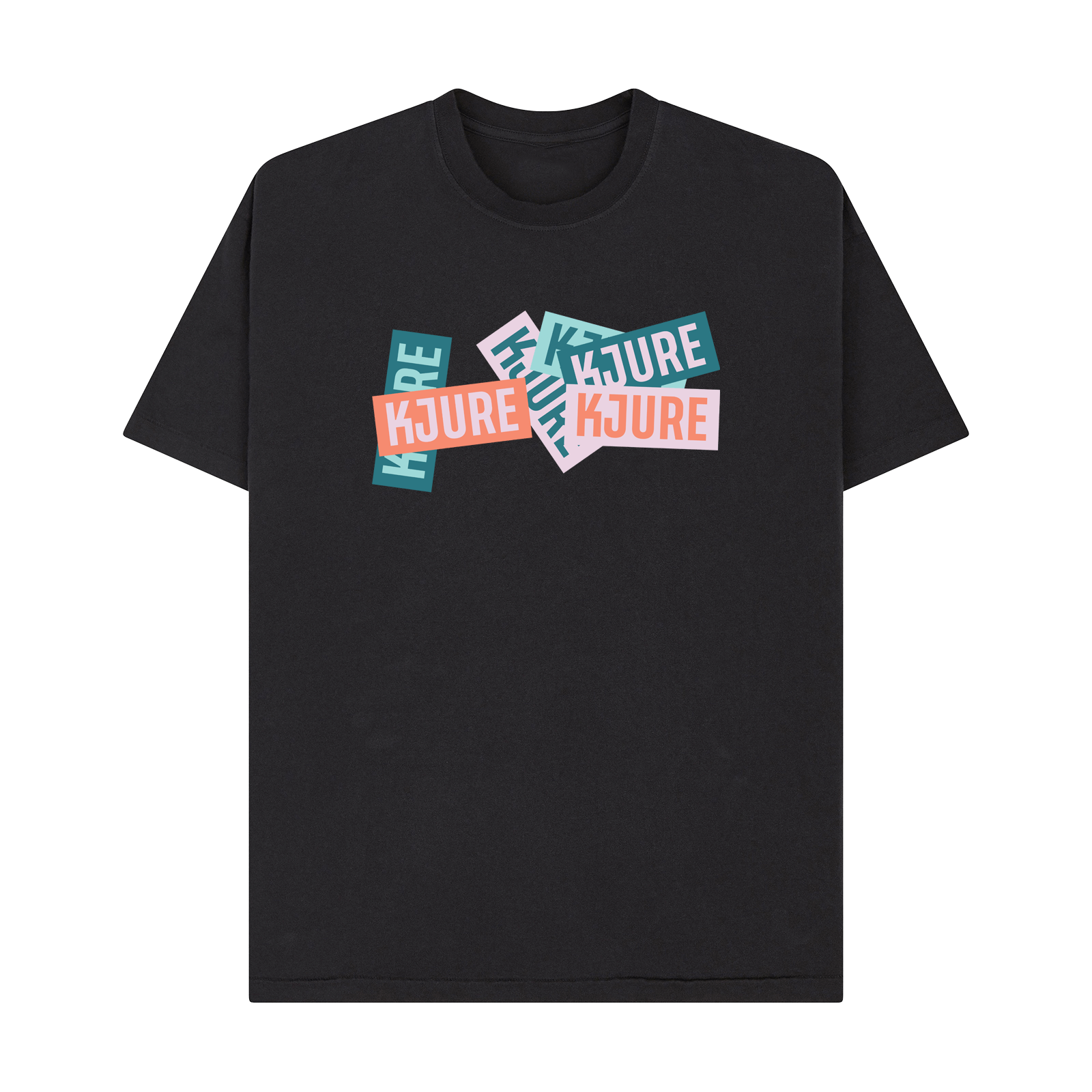
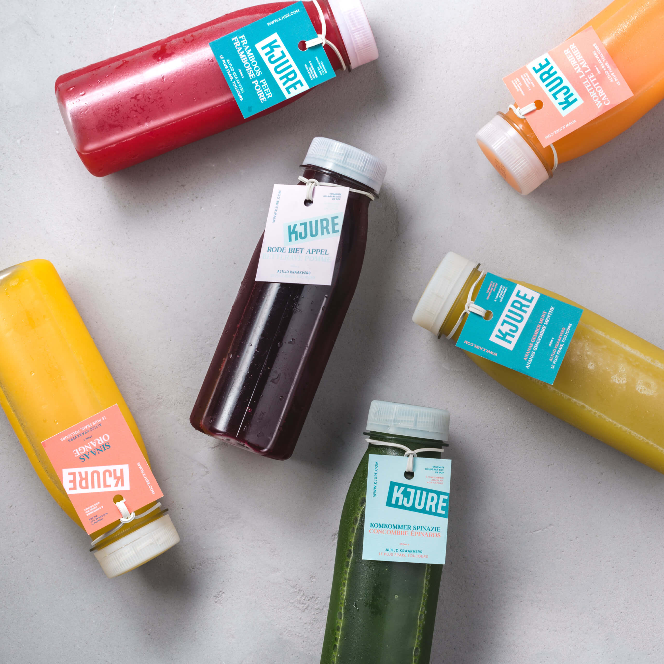
Wanting to stand out and be an eyecatcher amongst healthy and unhealthy non cooking food options, I created a vibrant visual identity with an unconvential logo system made to be instantly recognizable. As a family owned company, Kjure means quality. Inspired by stamps & seals of approval, the logo is ment to be used as a sticker. Coming in 4 different color options, logo's are always plastered over eachother. Kjure is a clean, fresh and slightly more high-end brand but is still family-owned with a personal approach which is what inspired my typography choices.
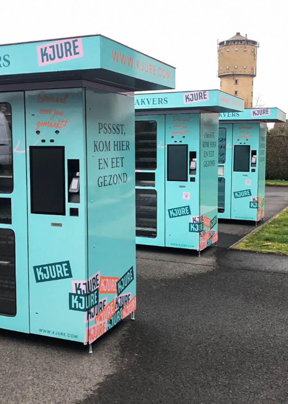
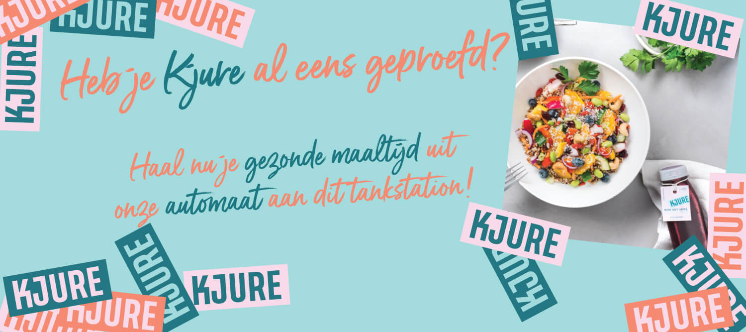
The rebranding constist of everything, from packaging systems to vending machines and everything inbetween. Due to their rebranding, Kjure now portrays what they should portray: accesibillity, quality, elegance, healthy & fresh food.
CLIENT KJURE ROLE Graphic Designer YEAR 2019