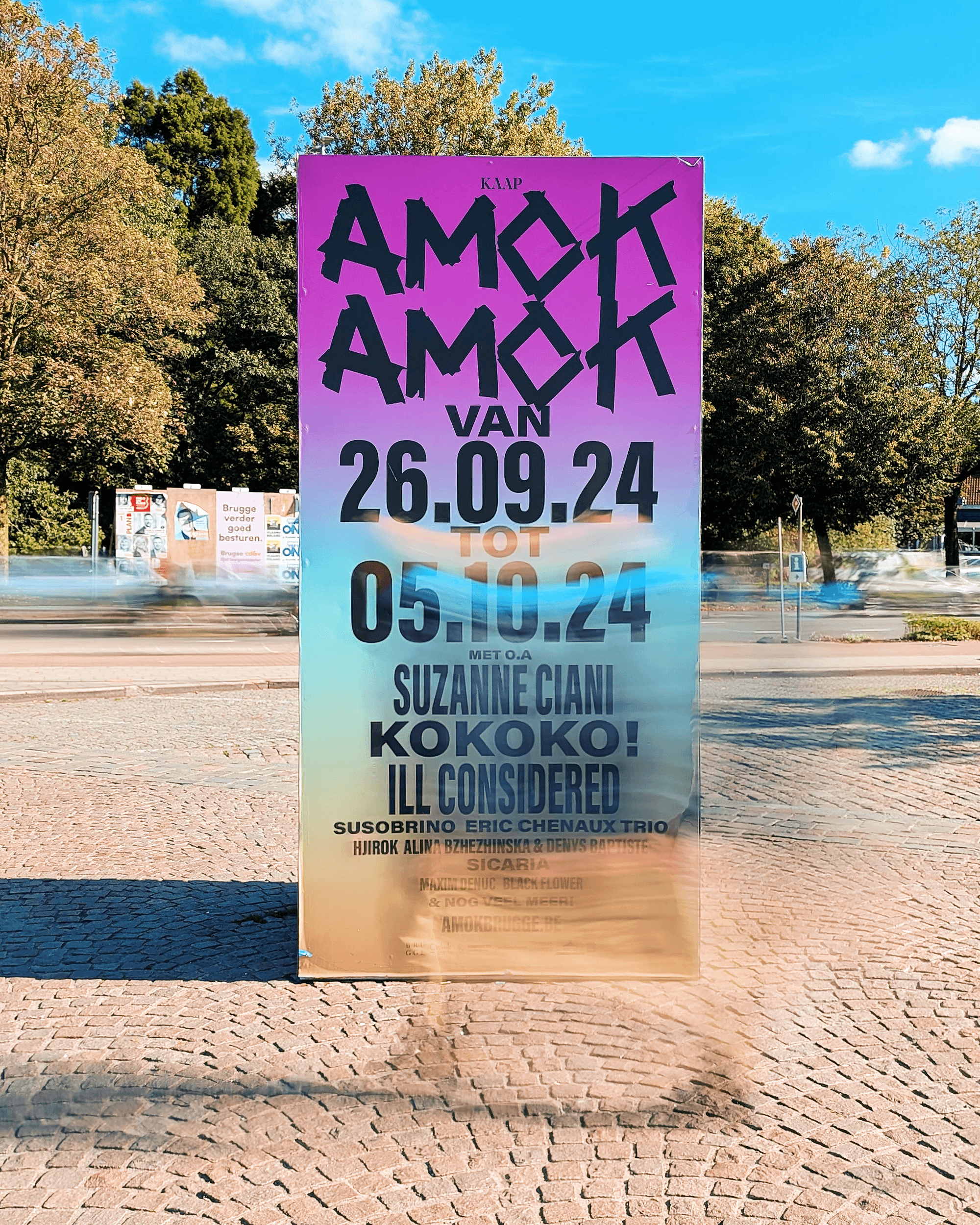
AMOK
AMOK is a dynamic 10-day festival featuring a diverse array of music, talks, and performances at the arts center KAAP in the heart of Bruges. Since its inaugural edition in 2019, I have been responsible for developing the festival’s visual identity. For the 2024 edition, we undertook a complete rebranding.
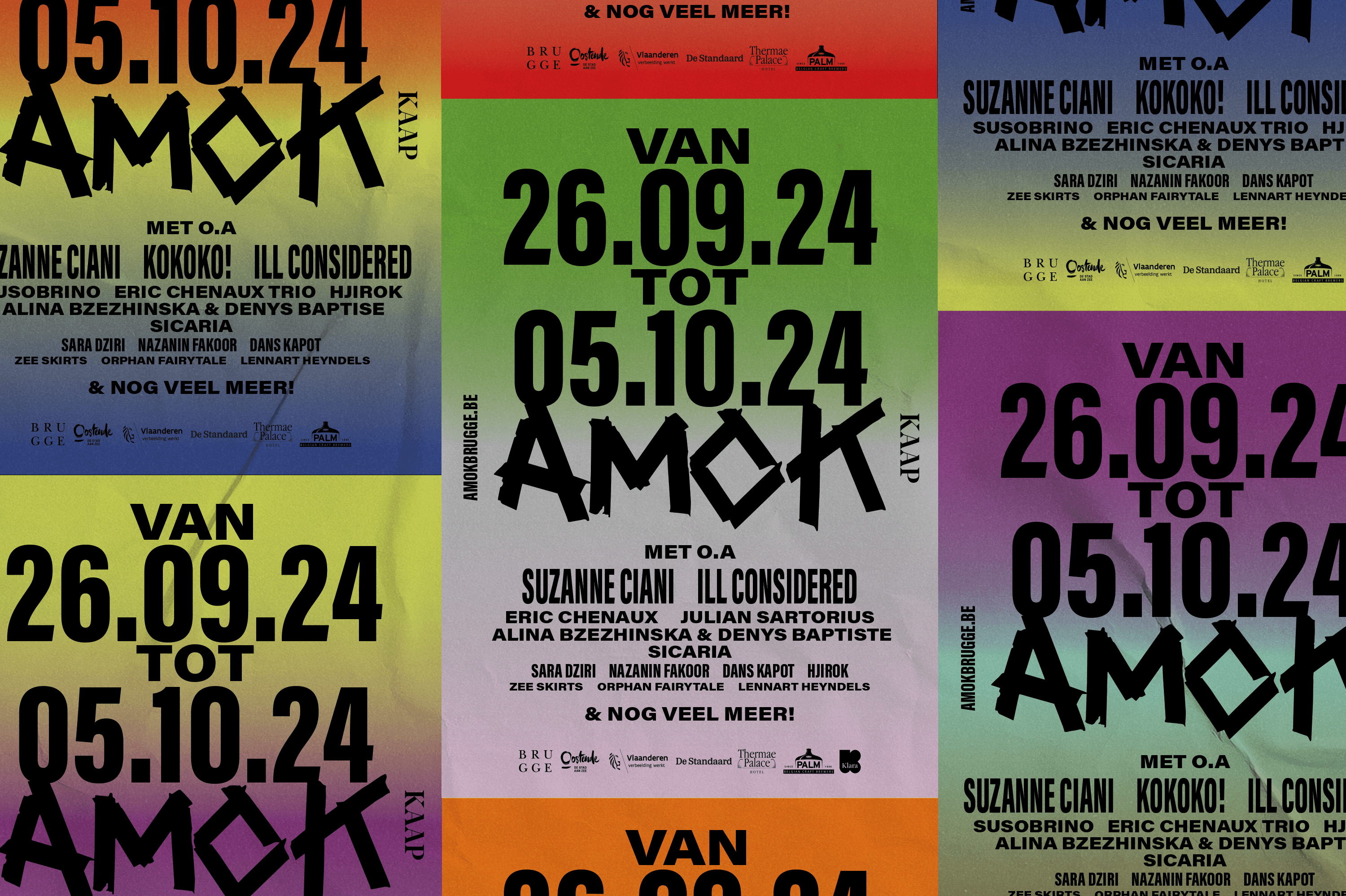
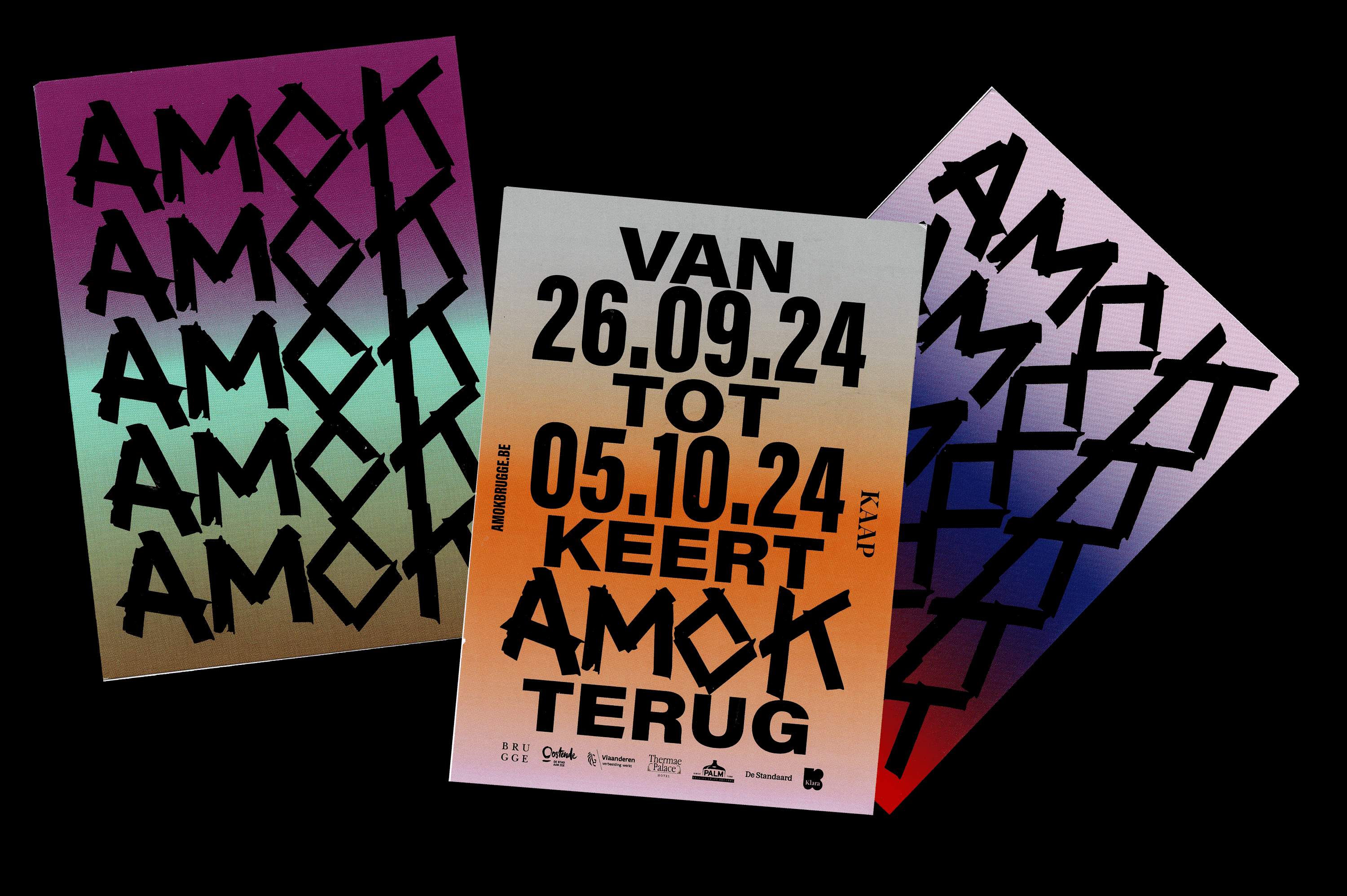
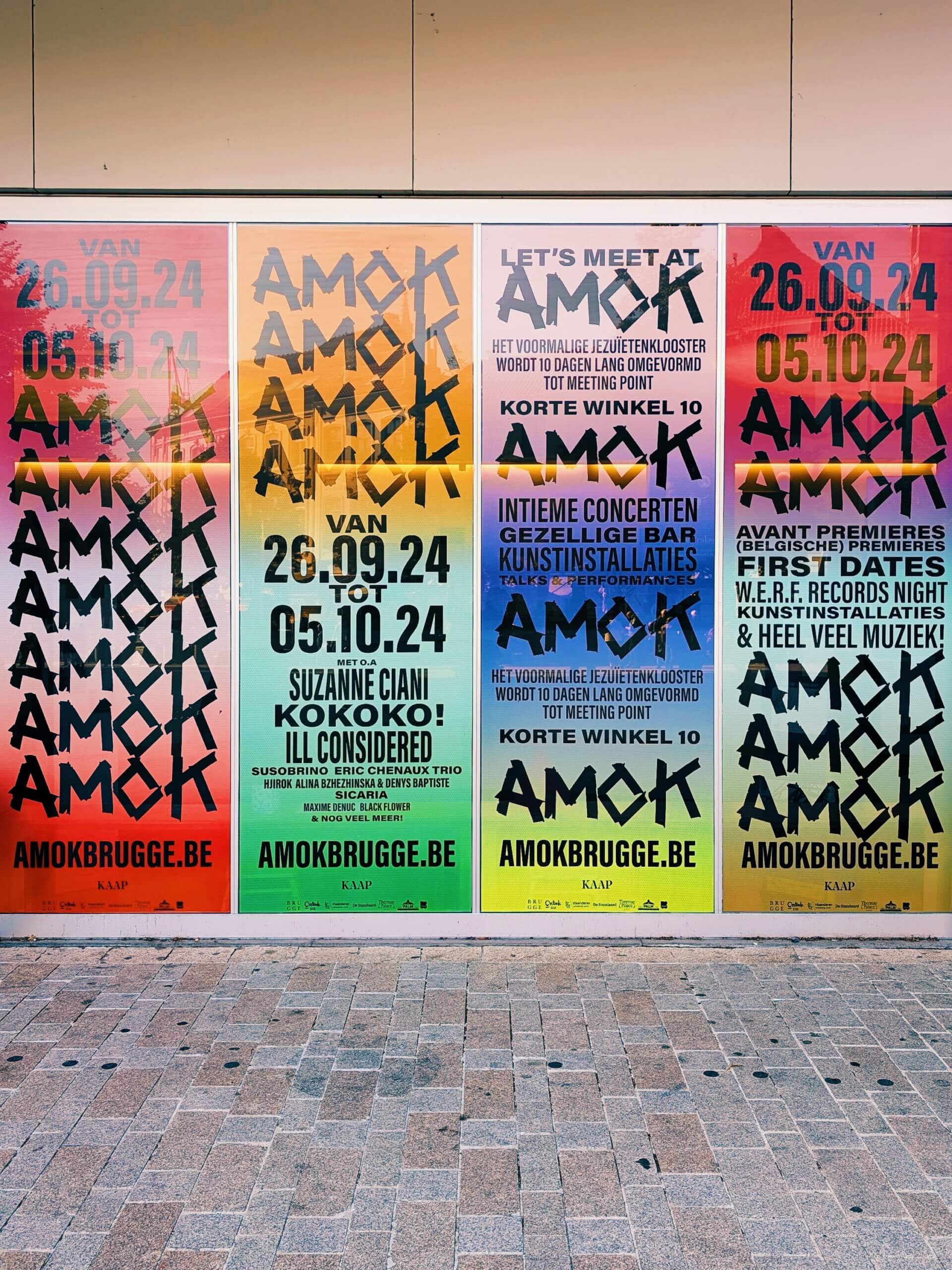
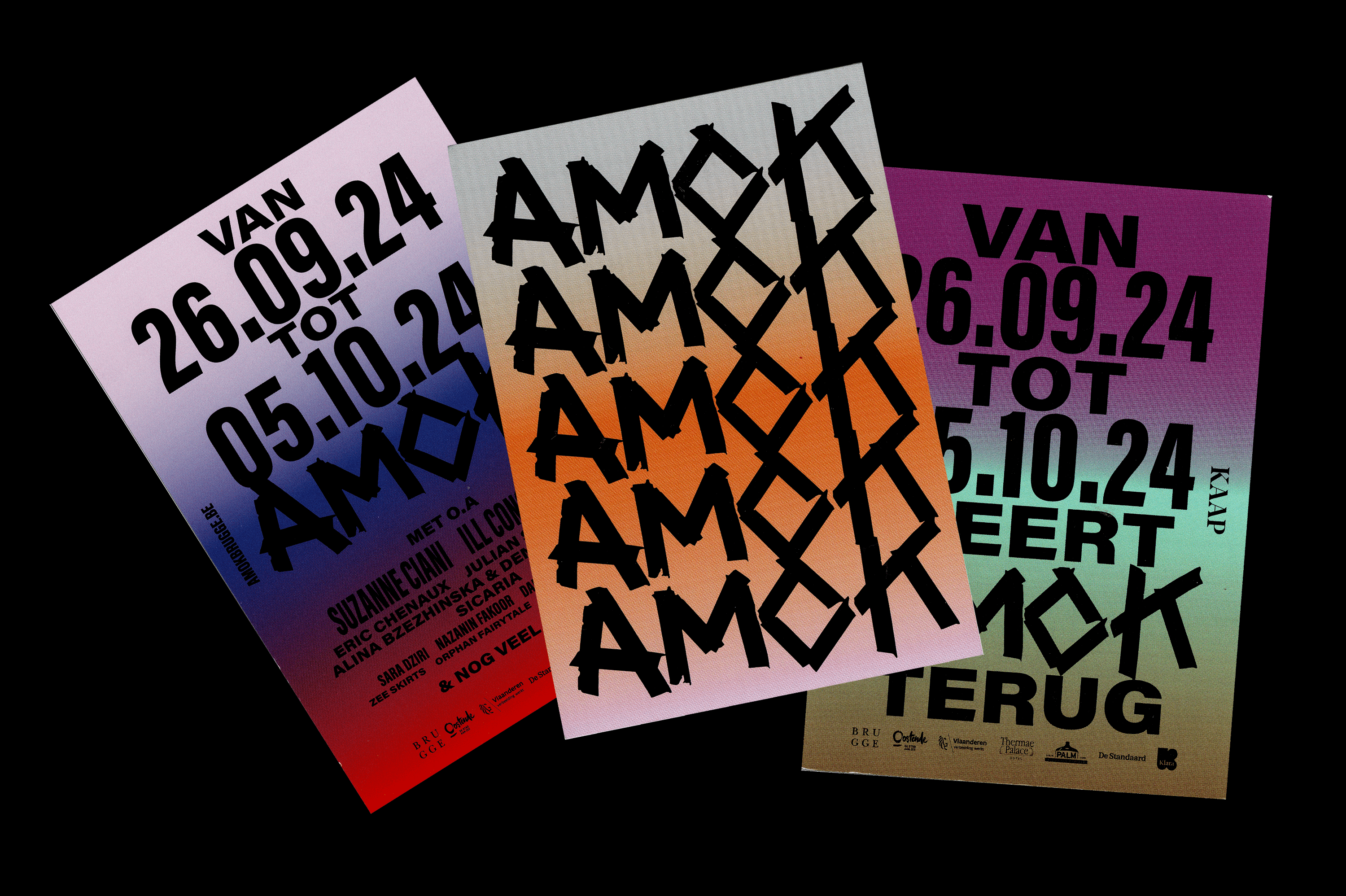
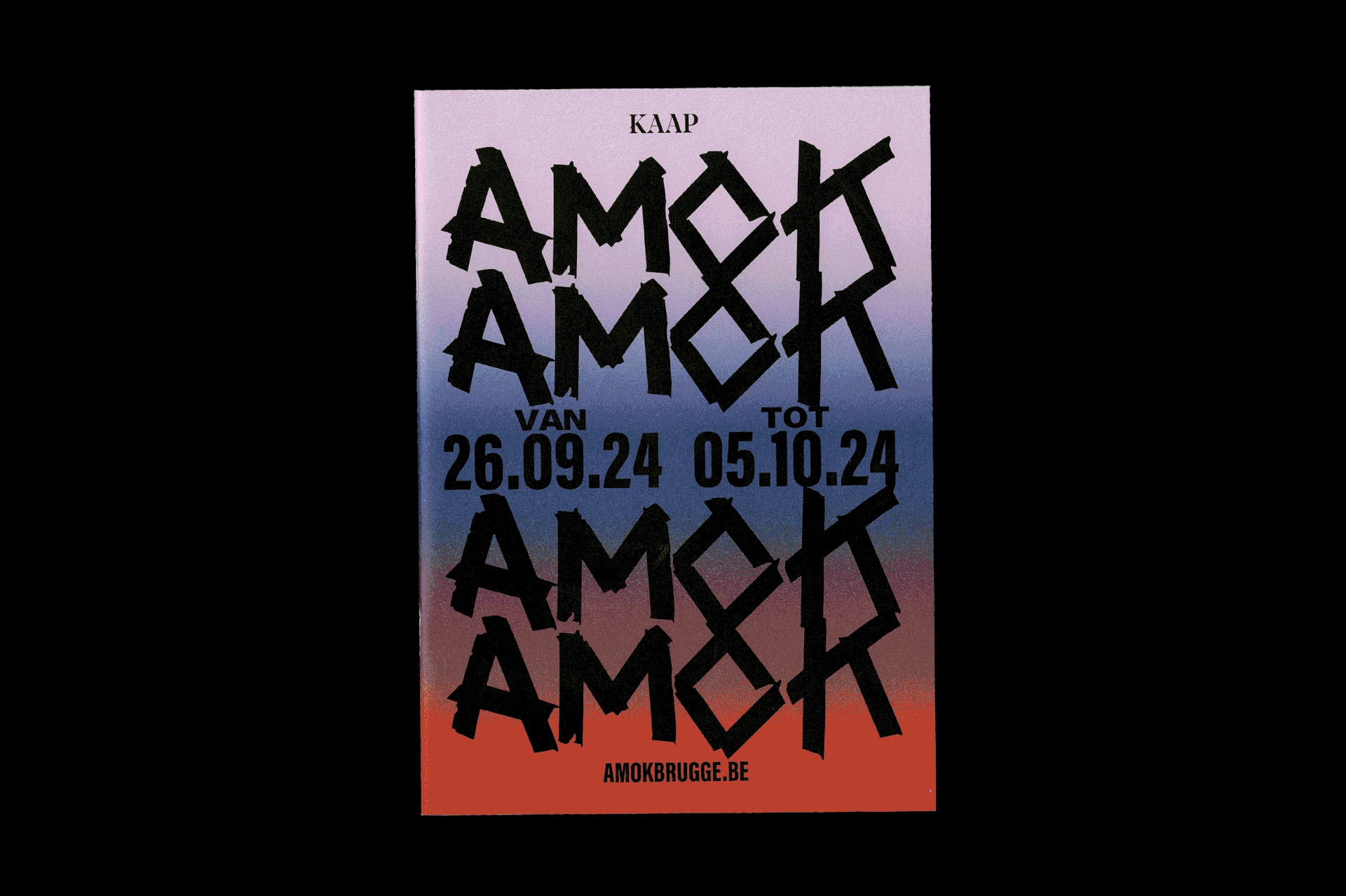
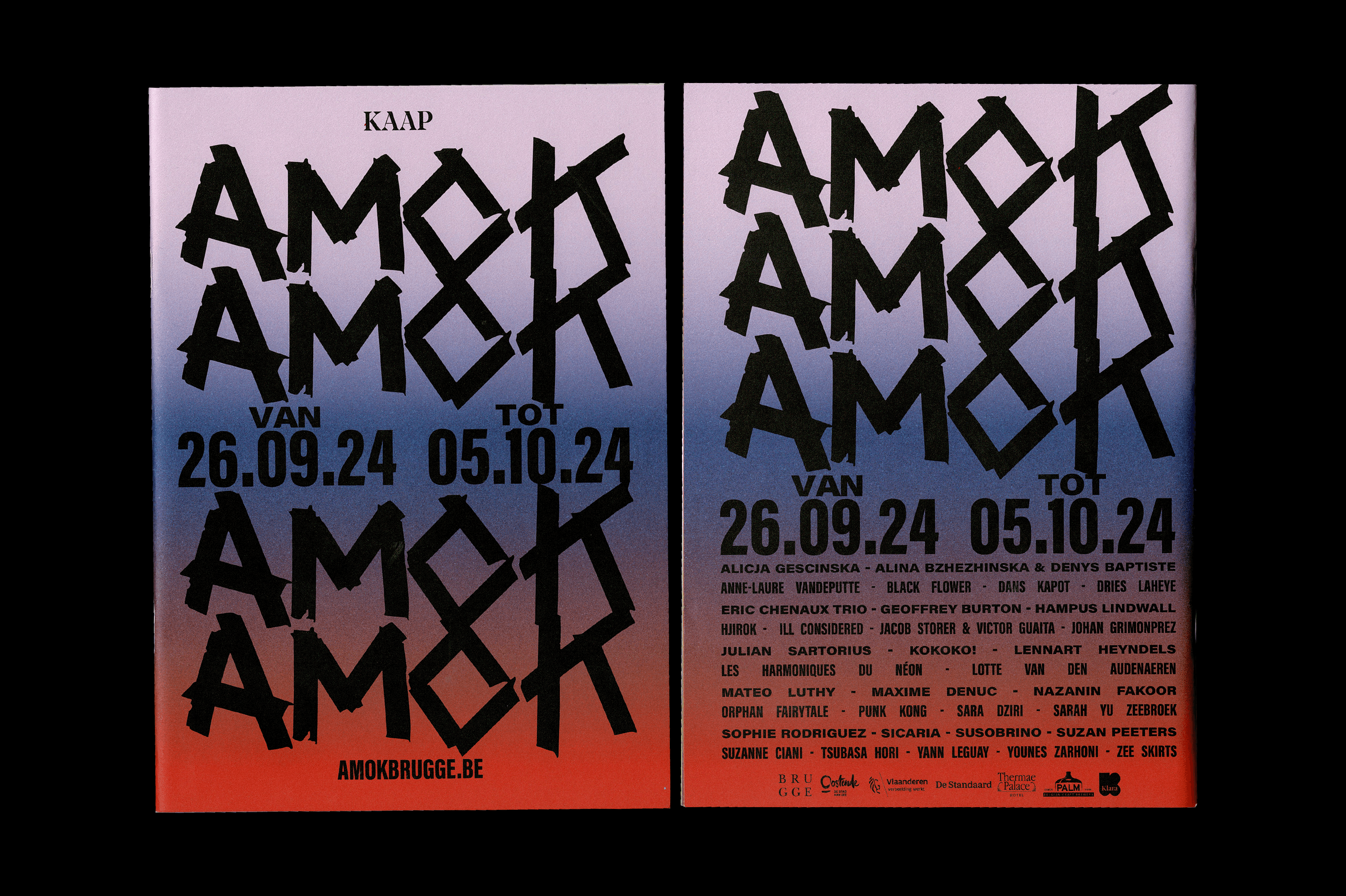
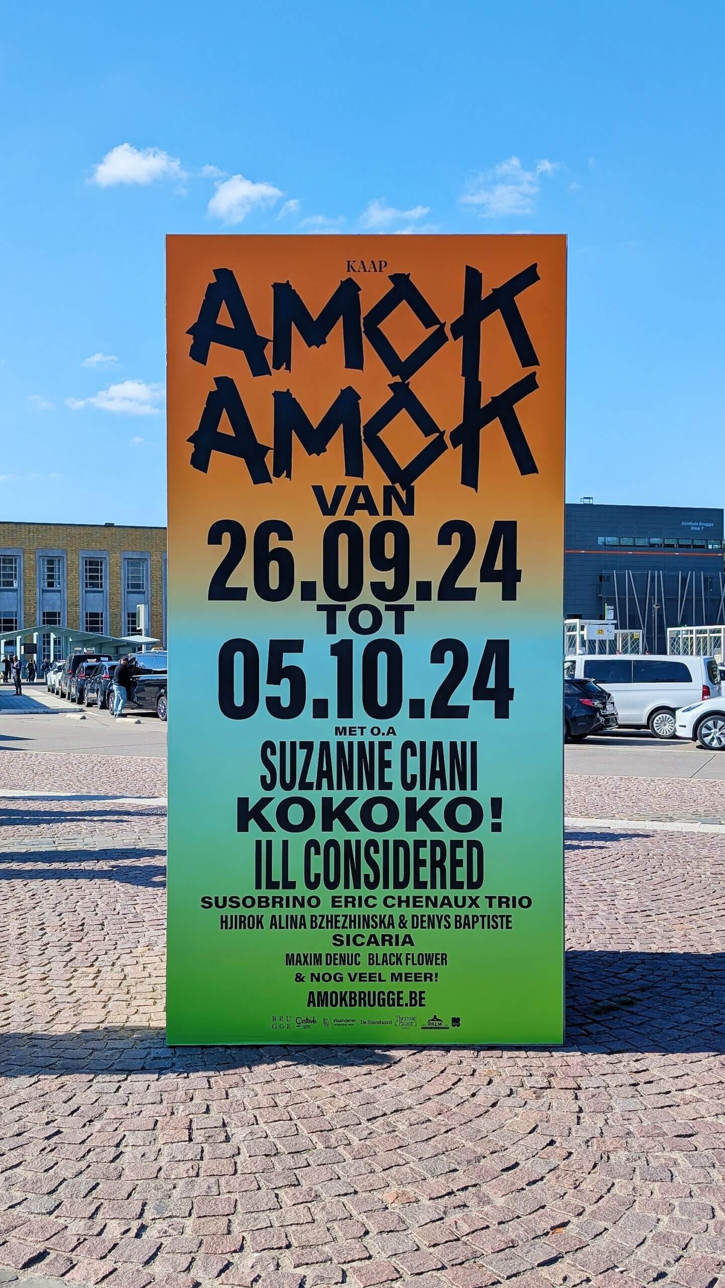
With a lineup of varied artists—spanning music, performance, poetry, and more—AMOK seeks to disrupt the tranquil atmosphere of Bruges by creating a vibrant 'amok.' This year’s identity draws heavily on themes of protest, reflecting the festival's pillars of disruption and decontextualization. AMOK stands as a bold challenge to the status quo.
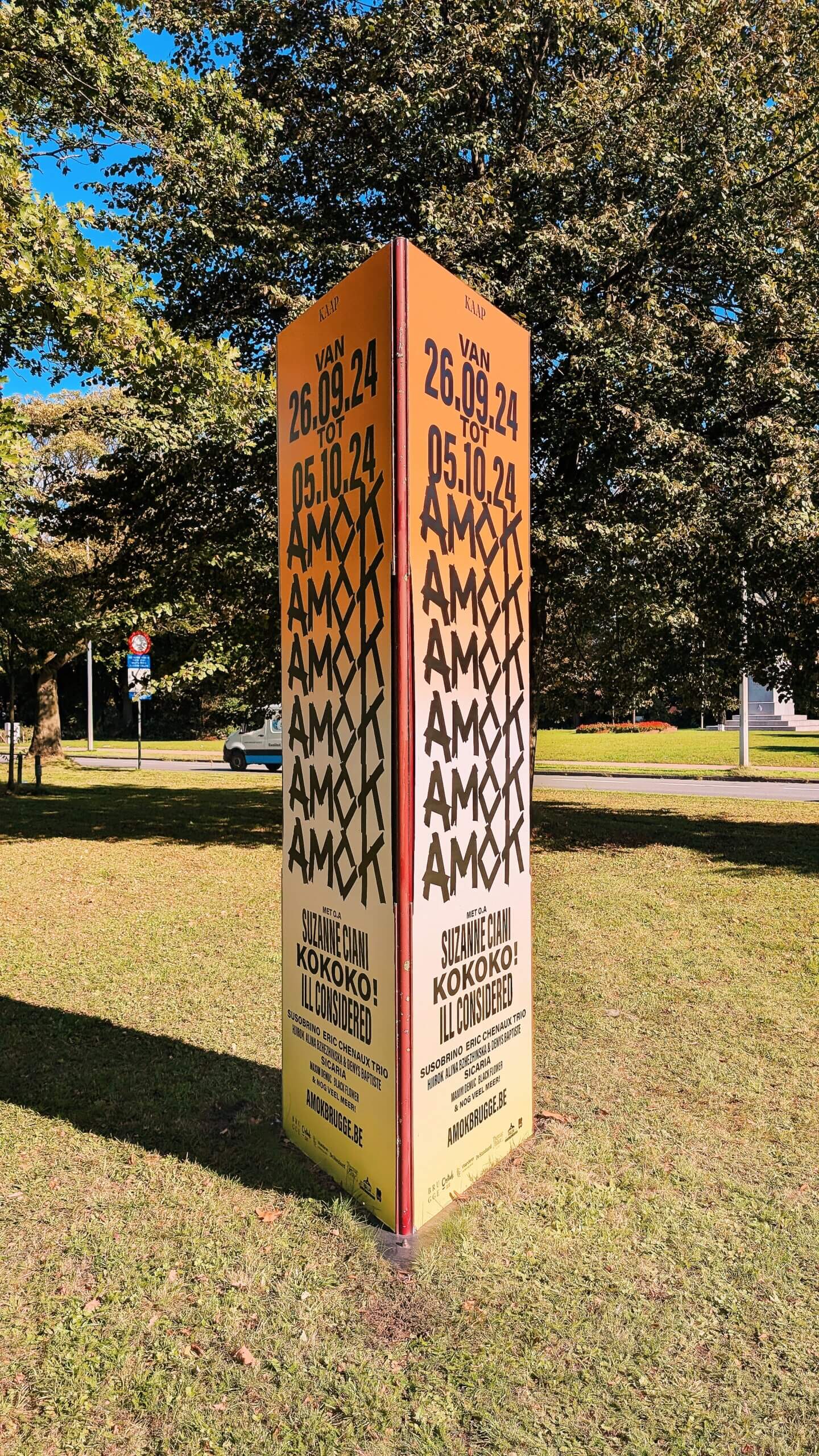
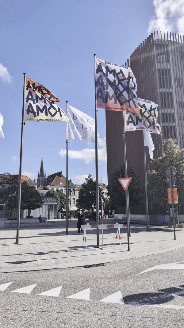
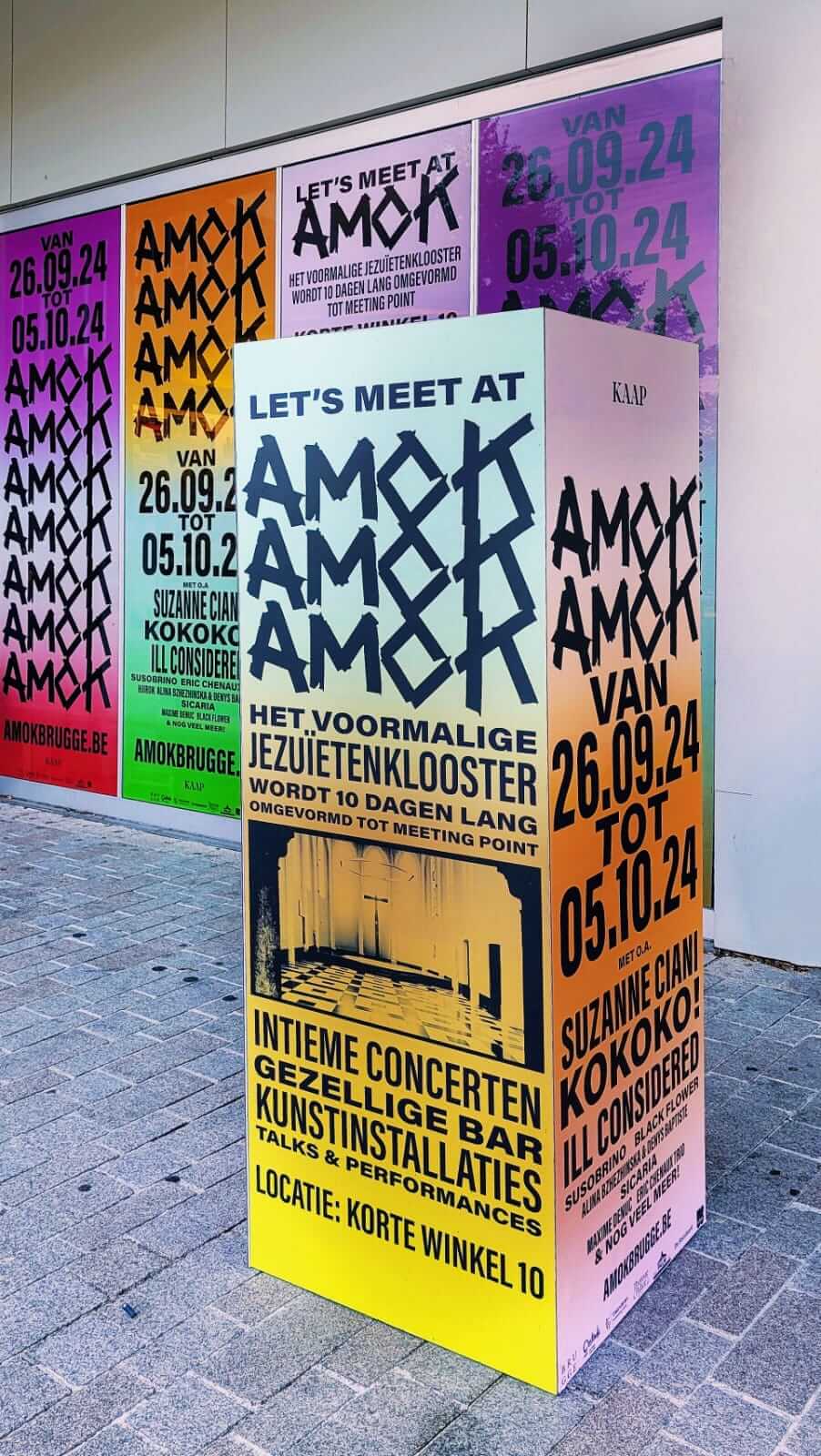
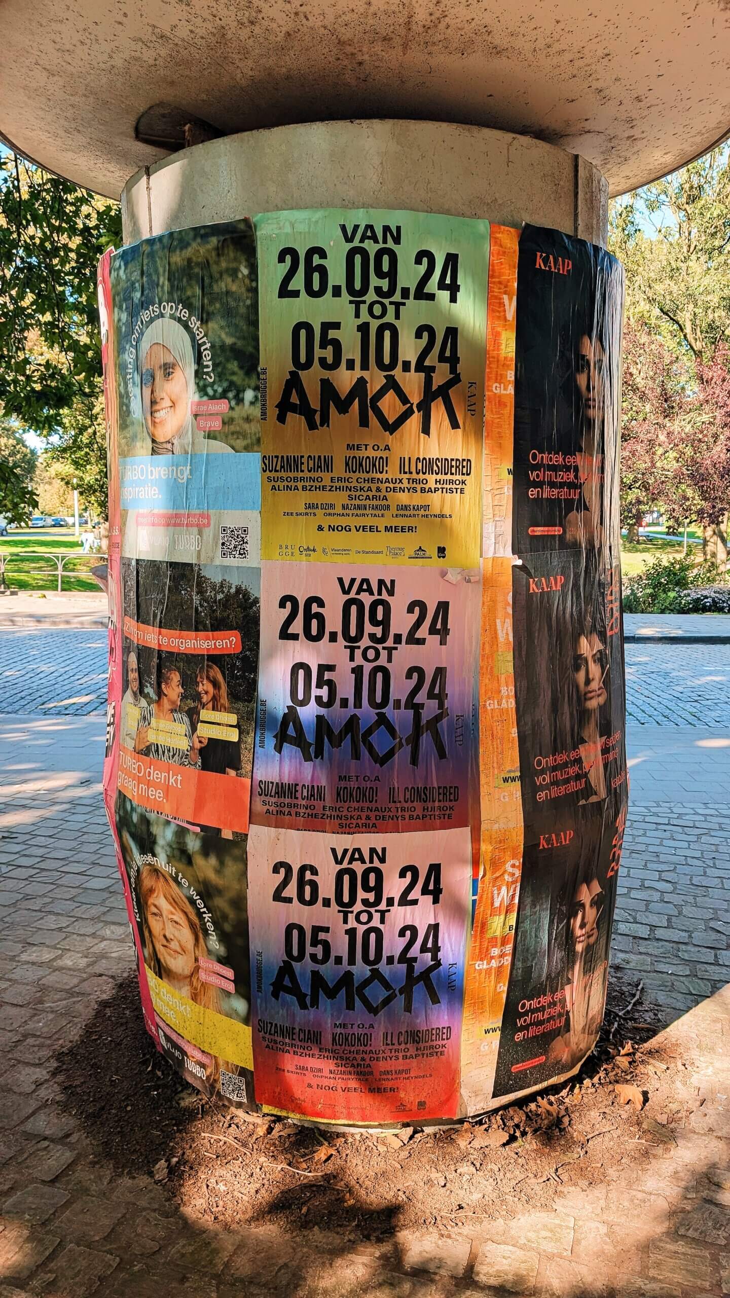
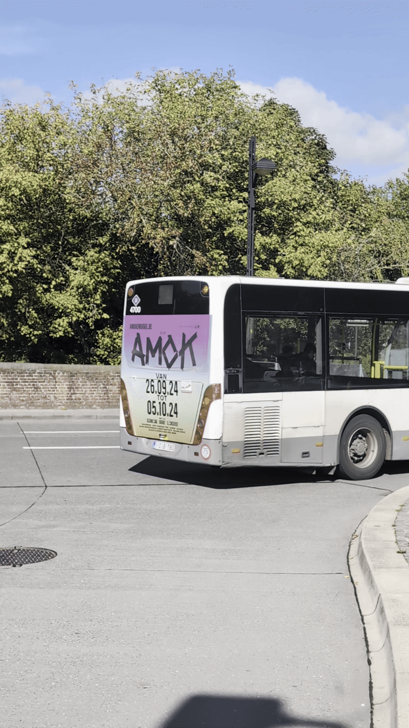
Visually, I embraced a DIY aesthetic reminiscent of protest signs, employing a monochrome palette of black for all text and imagery. The logo is crafted from tape elements, while the typography plays with varying widths. This approach symbolizes the festival’s mission to unite different art forms and communities. Instead of a fixed color scheme, we incorporate a wide spectrum of colors for backgrounds, allowing the combination of hues to define the visual identity. This reflects our belief in the power of diversity, inspired by the iconic gradient backgrounds of Colby Printing, which blend our DIY ethos with a commitment to visual impact.
To further enhance this DIY approach, I collaborated with Buro Gutter to create a user-friendly tool for generating these gradient backgrounds without the use of any design software. Combined with basic animation assets, the goal was to let the client roam freely within this tool while still maintaining the visual identity. This innovation allows the client to easily produce digital media graphics that prioritize messaging, further echoing the essence of DIY protest posters.
CLIENT KAAP ROLE Graphic Designer & Creative Director
TOOL DEVELOPMENT & MOTION Buro Gutter YEAR 2024
© Davy Denduyver 2024